
Hey again, in this text-based tutorial, I am going to talk about responsiveness in a website, like how your website looks on mobile, tablet, desktop, and other devices. Generally, for responsiveness, we use libraries like Bootstrap, but since it's the topic for the next video and text-based tutorial, in this one, I will give you some idea by showing some code and the media query in CSS to make it responsive. So without any further ado, let's begin and get straight to the topic.
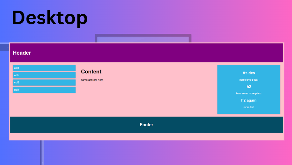
So above you can see a website on the desktop that fits on it and has components like a header. We can also add a navbar above the header, but I didn't include it here. After the header, there are some columns with content in them, and then an aside on the right or multiple asides, followed by a footer. This generally gives a simple website structure. When we switch to mobile or tablet, it should respond to that too.
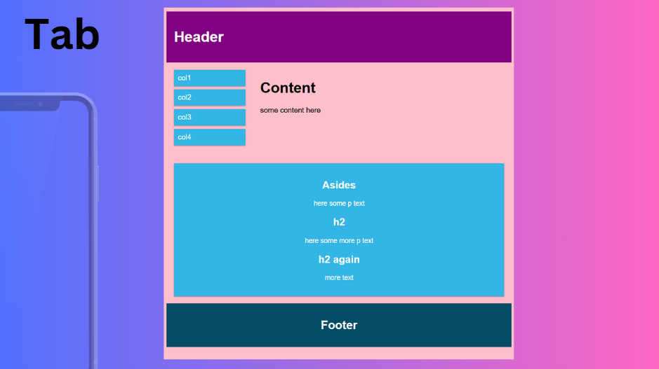
As shown above, on the tablet, the layout adjusts based on the screen size. Tablets have smaller screens than desktops, so the components get smaller too, but the content remains the same. The header, columns, and asides become another component below the columns, followed by the footer. When we switch to mobile, it responds accordingly as well.
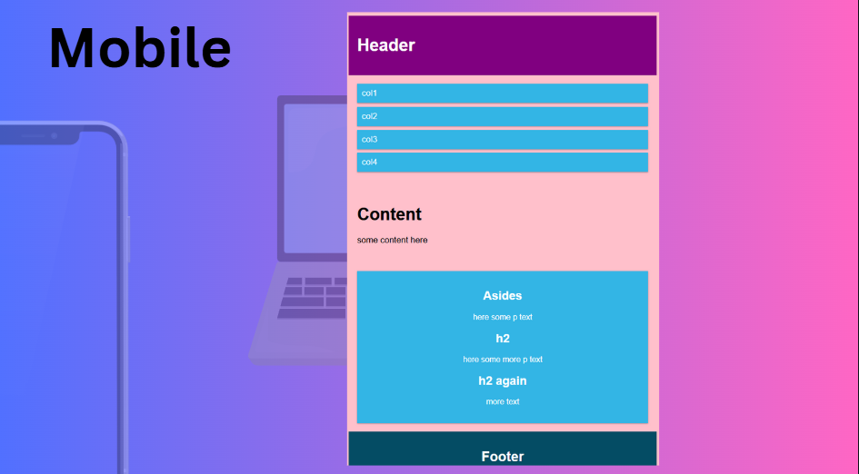
As shown above, on mobile devices, the components get even smaller, but the content remains the same. The sizes adjust accordingly to ensure responsiveness across all three devices. Now, let's see the entire code from HTML to CSS step by step.
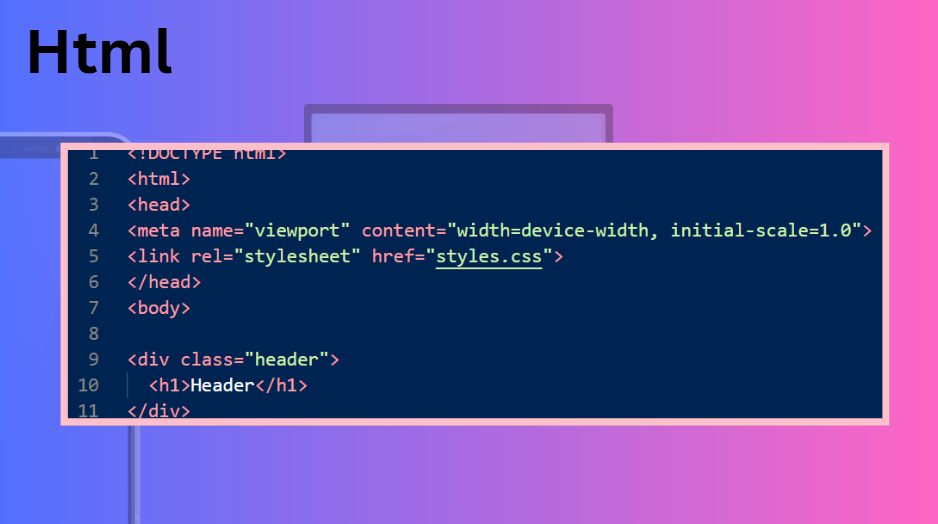
Here you can see the basic HTML code above, including some boilerplate code that we have seen many times. Let's start with the meta viewport tags, which help us determine the current screen size where the website is displayed, allowing us to make it responsive. You can also see that I added a stylesheet link, and that was it for the head section. There's nothing more to explain there as you already know the basic HTML code. After the head section is the body, which contains the visible content of the website. Here, I'm adding a header in a div and assigning the class "header" to it so I can manipulate that class. Inside the div, I'm adding a simple h1 header.
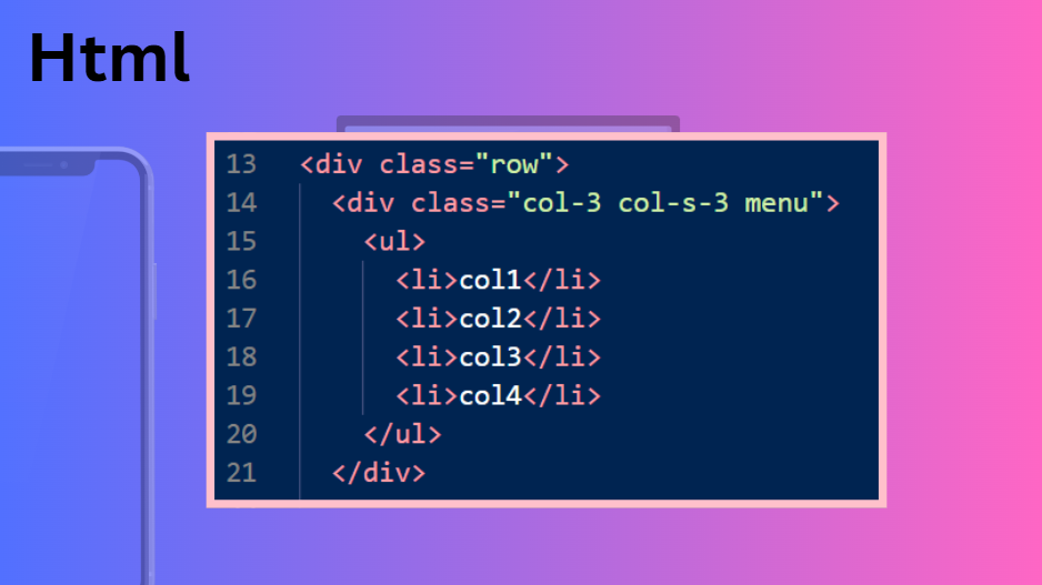
After the header div, I added another div with the class named "row." In that class, I added another div with the classes "col-3 col-s-3 menu." I intentionally named it like that because, in Bootstrap, most of the classes are named similarly. This means that "col-3" is for the default size, and "col-s-3" is for small sizes, and "menu" is the menu. You will understand more about it when you read and see the CSS part of this, so don't worry. In that second div, I added some columns in "li" which are enclosed in a "ul" or unordered list tag.
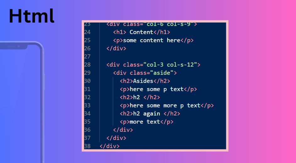
Now, after that, we get to the content and aside part. Here you can see I'm again using the div with the class name "col-3 col-s-3," the same one I used above. In this, I'm adding a div with the class named "aside," and in it, I added an h1 named "Asides" and then in a p tag, I added some text. Then, I added some h2 and p tags for some example content, and that was it. Then I closed the divs.
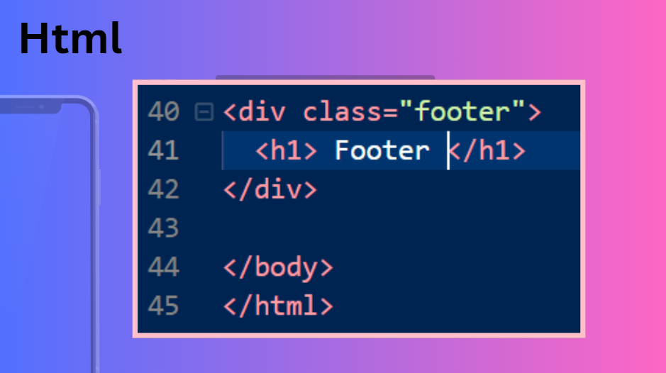
Finally, for the footer, I created a div with a class named "footer." Inside that div, I added an h1 tag with the text "Footer." This completes the HTML part. By simplifying everything into divs and classes, it becomes easier to manipulate them in CSS. Now, let's see the CSS part.
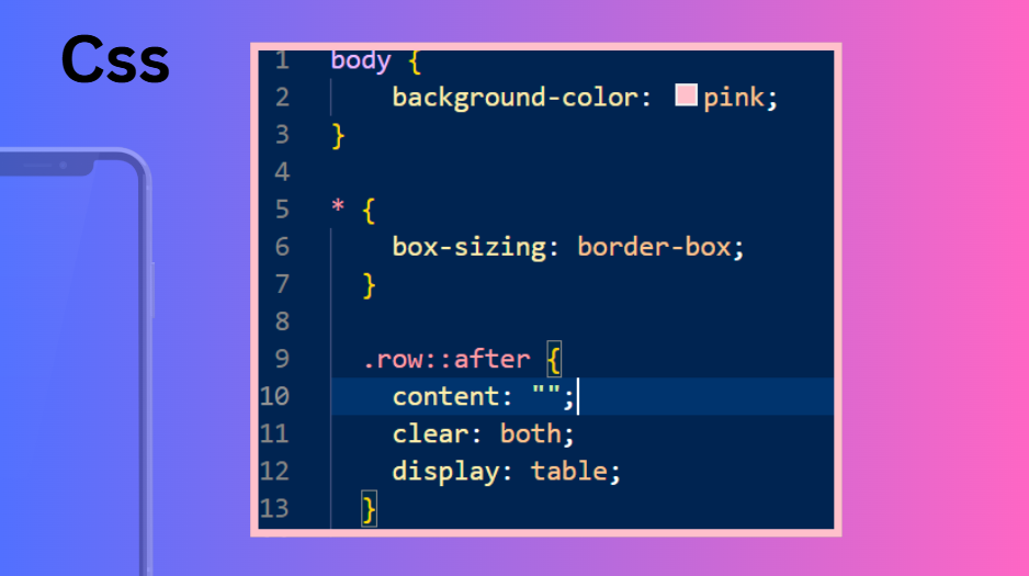
In the CSS part, we start with some basic styles. The `*` selector is a global selector that applies styles to all HTML elements. For example, we can set a background color for the entire page. Next, we have the `.row::after` selector. The `.` indicates that `row` is a class, which we added to a div. The `::after` pseudo-element is used to insert content after the element. Here, we add `content: "";` to insert an empty string and `clear: both;` to ensure that the element is displayed as a block and clears any floating elements.
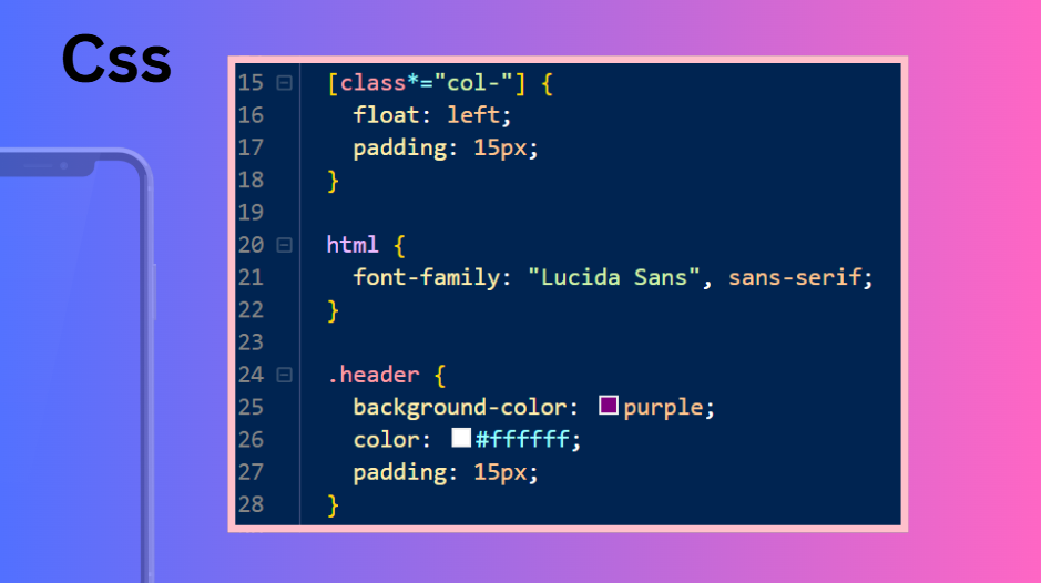
Next in the CSS is the header. Here, I use the `[class*="col-"]` selector to apply `float: left` and `padding: 15px` styles to all elements with a class that contains "col-". After that, I style the HTML tag with some font families. Finally, in the `.header` class, I added styles like `background-color: purple`, `color: white`, and `padding: 15px`. That was it for the header.
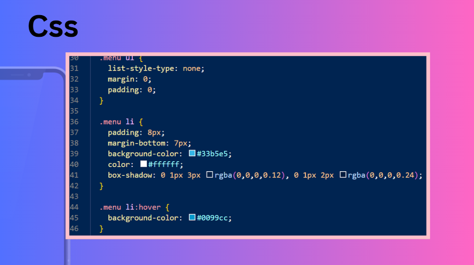
For the menu, I added styles in the `.menu` class. For the `ul` element, I added the style `list-style-type: none`, then set the margin and padding to 0. For the `li` elements within the same `.menu` class, I added styles such as padding, margin-bottom, background color, color, and box shadow, as shown above. Finally, I added some hover effects to the `li` elements, like changing the background to blue. That was the style for the menu.
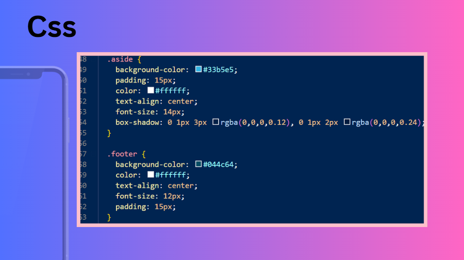
After the menu CSS, I added the styles for the .aside and .footer classes. These include basic properties like background-color, padding, text color, text alignment, font size, and box shadow. These are the basic CSS properties we have seen before. Now, let's move on to the responsiveness code, which is the main focus of this text-based tutorial. I will try to make it simple and explain it so you can understand a little bit, as most of the time we use libraries like Bootstrap to style our websites and make it responsive.
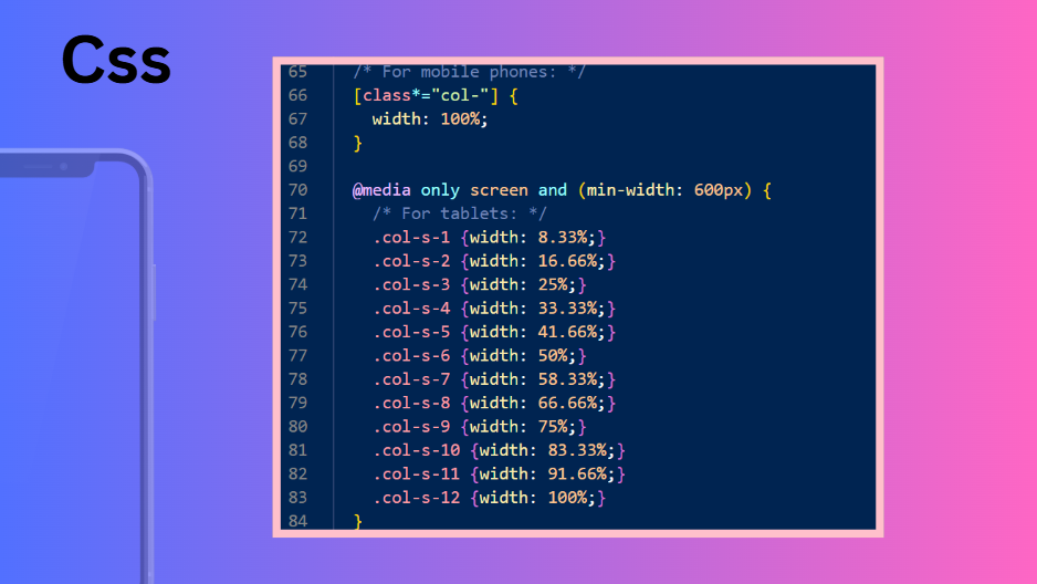
So here you can see I'm using media queries. For mobile, the columns are full width, and for tablet size, using a media query with a max-width of 600px, I'm using different column sizes. You can already see the complexity and messiness, which is why we use Bootstrap and its classes for the next time .
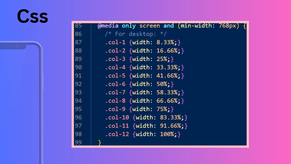
Here is the desktop view with a size of 768px. You can also add other custom sizes as needed. This is how you can customize responsiveness. The final result is shown below. Next time, I will talk about Bootstrap, which is very important because it makes everything nice, simple, and easy. Stay tuned for that.
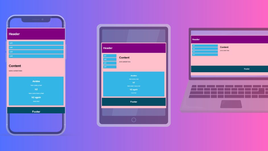
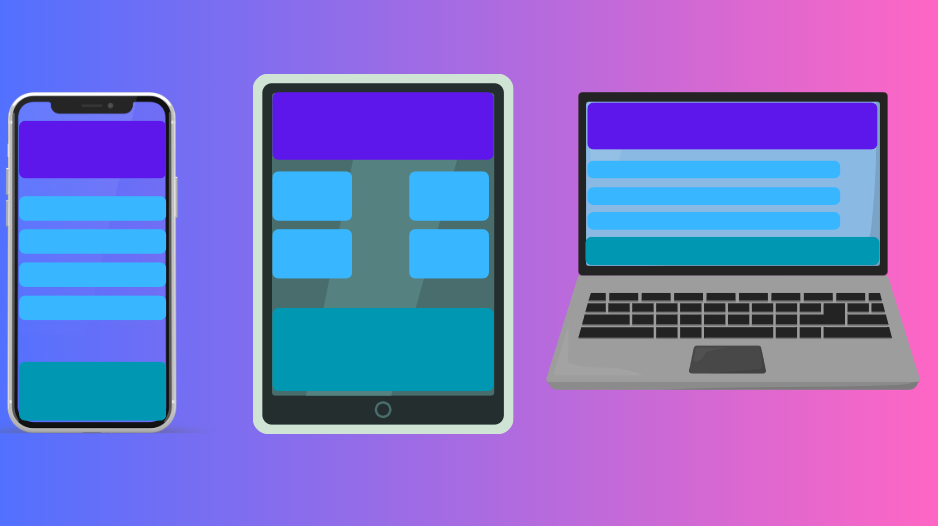
See different Responsiveness for different screens

26 Jan 2025 , Abdul Rauf Jatoi